Parsing a .xlsx file generated by Labchart
Create a beautifully simple website in under 10 minutes 🚀
My wife often complains about manually repeating a lot of steps for her research. With a little python skill, I would love to help. So I asked her what she’s been working on recently. One of her experiments aims to measure the change of pressure and volume of a mouse’s heart, the pressure-volume loop of heart contraction/relaxation.
The data are collected through LabChart Pro, and there are options to output to different formats, including .txt, .xlsx, .mat. Throughout her career, her colleagues and she mostly use Excel to process and to plot the data. However, she doesn’t know any fancy tricks of Excel, and often hanlded the data manually. The more mice used for the experiments, the more times she needs to repeat. And without remembering all the processing steps, she can’t be sure that all data-processing is done consistently. It leads to another hot topic in all fields of science in recent years: the lack of reproducibility.
Step 1: Data inspection
I first looked into the .xlsx file she gave me. The original measurements are stored into four columns: time, pressure, volume and loop, together with many lines of header summarizing the experiment setup. I decided to skip the headers for now. One file measures one mouse for a specified period. For this specific case, there are twelve PV-loops, whose starting time-steps are marked in the loop column.
import pandas as pd
import matplotlib.pyplot as plt

# Load in data using pandas:
cols = ['Time','LV Pressue','LV Volume', 'Loop']
df= pd.read_excel('336-ivc2.xlsx',names=cols, usecols = "A:D",skiprows=140)
Step 2: Data cleaning
One thing I noticed, the loop column only marks the starting time-step of each loop. I want all rows from the same loop to have the same flag. I first filled the missing rows with the last available value, then extracted the loop number and converted the column to numeric.
df=df.fillna(method='ffill') # Foward Fill the missing value
temp=df['Loop'].apply(lambda x:x[12:14])
df['Loop']=pd.to_numeric(temp.str.replace(';', ''))
Step 3: Plotting/Groupby/Processing
Now I can easily select and visualize each loop’s PV changes.
df[df['Loop']==1]['LV Volume'].plot()
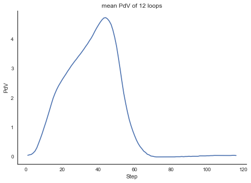
The goal is to visualize the mean of all 12 PV loops. To do that, I first created a new Step column to index the steps in each loop.
def restep(series):
    length=len(series)
    new_steps=[x for x in range(1,length+1)]
    return new_steps
for loop in range(1,13): # Must inspect the .xlsx first
    df.loc[df['Loop']==loop,'Step']=restep(df.loc[df['Loop']==loop,'Step'])
I created another column, PdV, defined as $\frac{P}{V-V_{0}}$. This is the variable we want.
df['PdV']=df['LV Pressure']/(df['LV Volume']-3.902683)
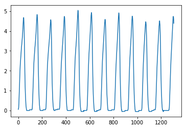
The twelve PdV loops look like this:
df.PdV.plot()
The Step column comes in handy to plot the mean of the twelve loops.
import seaborn as sns
sns.set_style("white")

# Groupby eman
gbmean = short_df.groupby('Step')['PdV'].mean()
ax=gbmean.plot()
plt.title('mean PdV of 12 loops')
plt.xlabel('Step')
plt.ylabel('PdV')
sns.despine()
plt.show()
Pandas is powerful, but I am pretty sure that some Excel gurus can do the same thing quickly. It’s fun to work on data that I have zero knowledge of. I’ll try to rewrite some of the processing steps into functions that my wife can easily apply to the new .xlsx from the same experiment.
Yu Cheng 鄭嵎
Sustainability Data Scientist
Passionate about leveraging my past experience to make positive impacts on the planet. Well, raising two wonderful children heartfully is a good start.